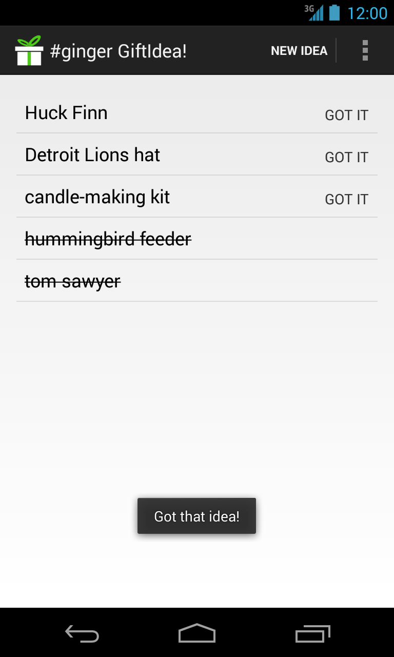
I put an Android app named GiftIdea! on the Google Play Store for the first time last week. I have never needed screenshots for a project before, so I looked around for what other developers are doing. From this bit of research, I created a few principles to follow.
| Click to Enlarge |
|---|
- Follow Chekhov’s Gun
Remove everything that has no relevance to the story.
Many screenshots are taken without much forethought, and it often shows with overcrowded notification areas. Some of the most common offenders:
- Google Play Updates
- New Mail
- Debug Mode
- Words With Friends
- Bluetooth Indicator
- Alarms
- Wi-Fi Meter
I took a few minutes to clear notifications and turned off bluetooth, wifi, and my alarms before taking screenshots. While I generally have bluetooth and wifi on at all times, neither are currently required or used by my app. I think the display is all the better for it.
- Don’t Make Customers Anxious
Spotty service and low battery life are guaranteed ways of making me anxious. I use my Android for directions, ordering food, and searching for interesting places on the go. As a result, I’m much more dependent on it than I’d like to admit.
I put my phone on the charger and made sure I was within good coverage before taking screenshots.
- Don’t Give Customers Questions
Screenshots should clear up questions about how an app works, not raise questions about how well it works. Some scenarios that caused me questions of quality or were general distractions:
- 10% battery life => Is this app a battery killer?
- Time changes dramatically => Were there problems in development?
- Time is odd => Why are these screenshots from 4:13 AM?
To deal with this, all of my screenshots appear at 12:00 — a consistent and happy time, since many people are on lunch at this hour.
